Are you ready to elevate your handwriting and create stunning designs with just a pen and paper? Whether you’re a beginner looking to explore the world of lettering or a seasoned artist searching for new methods to express your creativity, this list is perfect for you. Below are fifteen innovative lettering techniques that you can start practicing today and add some flair to your projects.
1. Exploring Brush Lettering
Brush lettering combines fluid strokes with the versatility of a brush pen, allowing for beautiful and dynamic letter forms. Each stroke is a dance of the pen, creating elegant curves and points that can bring your lettering to life. One of the best features of brush lettering is its adaptability; you can use different brush sizes and styles to achieve various effects. This technique is not just about producing letters; it’s about creating art with each stroke. Many artists find this method liberating, as it allows them to experiment and develop their unique style.
When learning brush lettering, it’s essential to understand the pressure dynamics. Varying the pressure as you write will lead to beautiful thick and thin lines, characteristic of this technique. Utilize practice sheets to refine your skills, and don’t hesitate to explore different brush pens to find the one that feels just right in your hand. Experimentation is the key to finding your voice in brush lettering!
2. Mastering Faux Calligraphy
Faux calligraphy offers a way to mimic the elegance of traditional calligraphy using simple tools and techniques. This approach is particularly accessible to anyone with a pen, as it doesn’t require special equipment like a pointed nib or ink. Faux calligraphy is achieved by creating a continuous line letterform and then adding thicker strokes where the pen changes direction, which mimics the look of real calligraphy without the steep learning curve. This makes it a fantastic starting point for beginners.
Additionally, faux calligraphy allows for personalization. You can play around with different styles and embellishments to create a look that is entirely your own. Try out various pens and papers to see how they affect your writing. This technique not only helps you build confidence in your lettering skills, but it can also serve as a great introduction to more advanced styles of calligraphy in the future.
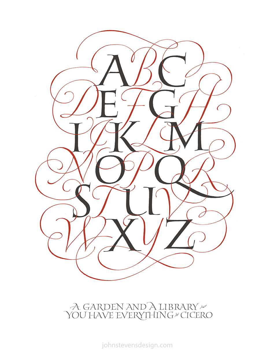
3. Creating Unique Serif Styles
Playing with serifs adds character to your lettering, providing classical elegance that can be adjusted to modern designs. Serifs—those small decorative strokes at the ends of letters—can dramatically change the feel of your text. When you experiment with different serif styles, you can evoke various emotions or themes in your work. For example, a traditional serif can suggest formality, while a whimsical serif can spark joy and creativity.
To create unique serif styles, consider the context of your project. Thick, bold serifs work well for headings and titles, while daintier scripts are suitable for invitations or personal notes. As you practice, observe how different styles convey different messages. With serifs, you have the power to transform the ordinary into something that feels timeless and unique!
4. Playing With Watercolors
Watercolor lettering introduces the beauty of color blending, creating stunning effects that suit a variety of projects. This versatile medium allows for soft washes and vibrant expressions, making it an excellent choice for both beginners and advanced artists. The sheer versatility of watercolor can transform ordinary text into works of art. You can create layered looks by varying the intensity of color, using wet-on-wet and wet-on-dry techniques. Utilizing different brushes and water amounts can lead to fascinating results, allowing for experimentation that is both fun and rewarding.
When working with watercolors, it’s essential to understand the drying time and how it can affect your lettering. You can embrace the unpredictability of the medium and let colors merge and flow into one another or maintain more control by allowing sections to dry before adding additional layers. Whichever method you choose, remember that the aim is to enjoy the process and let your creativity bloom.
5. Bold Block Letters
Bold block lettering can make a strong statement, and there are endless variations to explore and personalize. This style is perfect for banners, posters, and any project that requires impact. Emphasizing boldness creates a sense of presence that grabs attention and draws the viewer in. Utilizing varying widths, angles, and heights can give your block letters character and uniqueness.
To create depth and interest, consider adding shadows or outlines to your letters. Additionally, incorporating patterns or textures can elevate your bold designs into something truly memorable. Let your imagination run wild, and don’t be afraid to go big—bold block letters are all about making a mark!
6. Incorporating Shadows
Adding shadows to your letters can enhance depth and dimension, elevating the overall look of your work. Shadows create a feeling of realism; they can transform flat lettering into visually striking designs. To create shadows, simply choose a light source direction and consistently place your shadow in the opposite direction. Using varying degrees of darkness, you can achieve different moods for your lettering.
Experimenting with multiple shadow colors can also add an exciting twist to your lettering. This technique not only enhances your letters but also provides an opportunity to play with color theory. Shadows work wonderfully alongside different styles and can impressively complement script, serif, or block fonts alike.
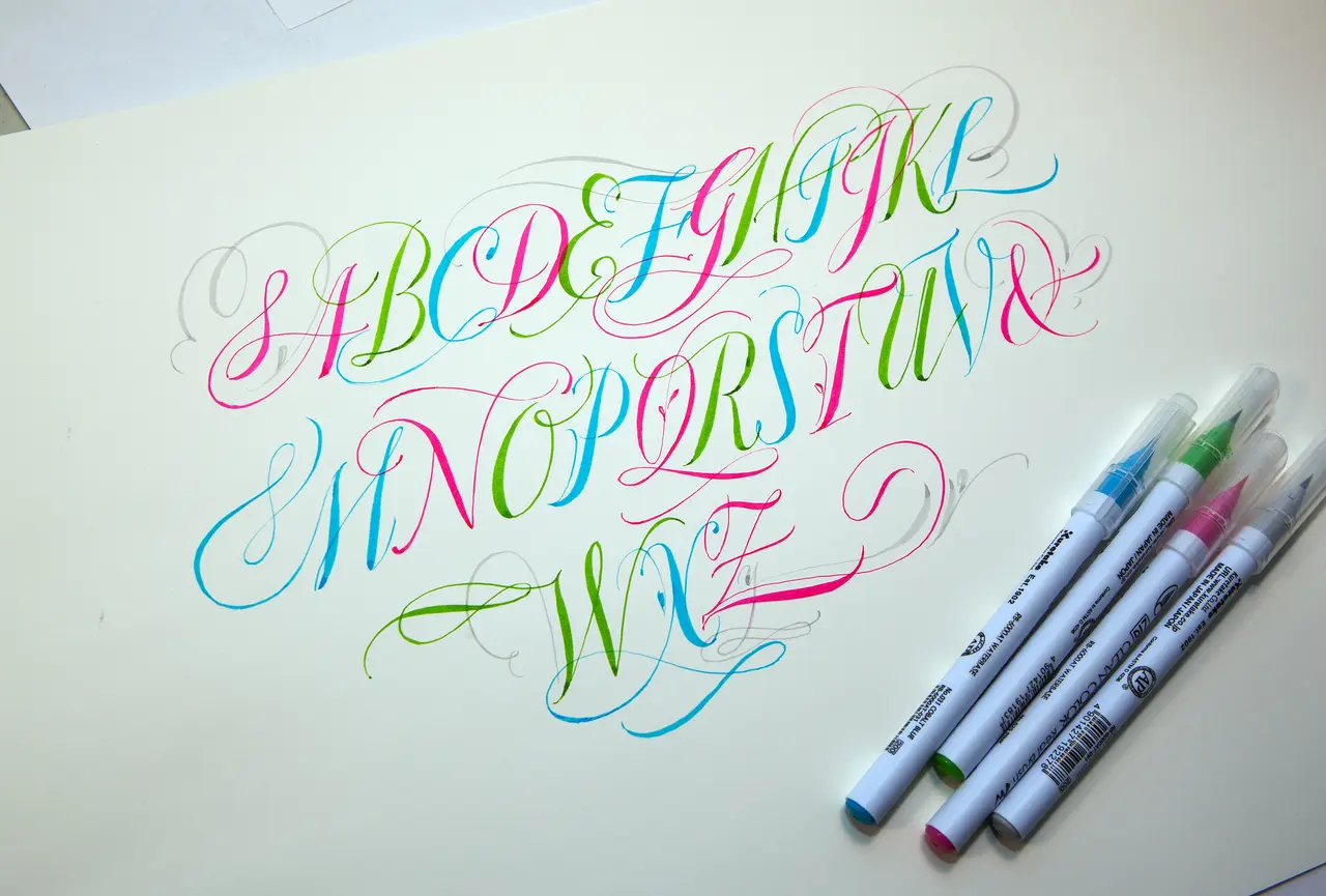
7. Using Gel Pens for Precision
Gel pens can offer a range of colors and smooth application, making them perfect for detailed lettering projects. Their fine tips allow for precision that is ideal for creating intricate designs, while the vibrant ink makes your letters pop off the page. The viscous nature of gel ink allows for ample blending opportunities, enabling artists to create gradients and shadow effects with ease.
As you experiment with gel pens, don’t hesitate to layer different colors or even use metallics for a striking finish. These pens are highly versatile, perfect for personal notes, greeting cards, or even more extensive projects like murals. The key is to find a comfortable grip and a steady flow to enhance your creative process.
8. Experimenting with Doodles
Incorporating doodles alongside your lettering can add whimsy and personalize your work. This playful addition not only enhances your creative expression but also makes your projects more visually engaging. Doodles can be as simple as little hearts or stars or as intricate as floral patterns. The beauty of doodling is that there are no hard and fast rules; simply let your imagination guide you!
When you integrate doodles with your lettering, think about how they interact. Doodles can frame your text, fill gaps, or even weave between letters, creating a cohesive look. This technique can serve to soften sharp lettering styles or add a playful feel to more formal designs. So grab a pen and doodle your way to a new artistic style!
9. Crafting Vintage Effects
Vintage lettering effects can evoke nostalgia, bringing elegance and character to modern designs. By using specific elements like faded colors, distressed textures, and unique serif styles, you can successfully recreate the charm of classic signage. There’s something inherently inviting about a vintage aesthetic that resonates with many. You can achieve this look through various mediums— from digital design to traditional pen and ink.
Consider playing with the layout of your lettering as well. Vintage styles often incorporate curves, arches, and other shapes that can enhance the overall message. By channeling your inner designer, you’ll find that vintage lettering can be both a tribute to the past and a modern-day expression of creativity.
10. Minimalist Lettering
Keeping it simple with minimalist lettering can create a clean and modern aesthetic that appeals to many audiences. In a world filled with intricate designs, a minimalist approach can stand out and convey sophistication. This style emphasizes clarity and often utilizes a limited color palette and basic shapes, allowing the text to shine on its own.
Minimalism doesn’t mean sacrificing creativity. You can explore various fonts and spacing to achieve unique looks. Sometimes, less is indeed more, and focusing on the essentials can lead to memorable statements in your projects. Embracing minimalism can challenge you to find beauty in simplicity, and it can transform how you think about your lettering.
11. Integrating Typography
Integrating various typography choices can bring new life to your lettering projects and showcase your creative flair. By combining different styles—such as script with serif or sans-serif—you can create visually engaging designs that capture attention. When blending fonts, consider contrast and harmony; utilizing differing styles can highlight key information while maintaining overall cohesion.
Always be mindful of spacing, as this will impact the readability of your text. The beauty of typographic integration lies in finding balance. Typography can elevate your lettering from simple to sensational, and it allows for personal expression within your art. Remember, experimentation is encouraged, and the more you play, the more you learn to tailor your typography.
12. Using Negative Space
Negative space can be strategically used to create unique designs that make your lettering stand out. The areas around and between your letters can tell a story of their own. Emphasizing negative space allows for creativity in how you structure your text while creating an eye-catching visual impact.
This technique often requires a shift in thinking—rather than just focusing on the letters, you consider the entire composition. Playing with negative space can lead to creativity that breaks the traditional rules of lettering. Don’t forget that sometimes, it’s what isn’t there that makes your artwork truly compelling.
13. Layering Techniques
Layering different styles and effects can create a rich and engaging visual experience in your lettering. This technique involves building upon base letters with overlays, textures, and shadows. You can start with a simple base and gradually add complexity—think about integrating patterns, colors, and other elements to develop a multi-dimensional look.
Layering promotes creativity as it allows you to experiment with different techniques that you might not have otherwise combined. By considering how each layer interacts with the others, you can create depth and intrigue that can elevate your lettering to new heights. It’s all about pushing the boundaries of what’s possible!
14. Incorporating Textures
Using textures in your lettering can add depth and interest, making your designs truly unique. Textures can range from subtle paper grains to bold patterns that demand attention. By applying textures, you can enrich the visual storytelling of your lettering and evoke certain feelings that resonate with your audience.
Textures are versatile and can be integrated both digitally and traditionally. Experimenting with different techniques, such as watercolor washes or sandpaper effects, can lead to delightful surprises in your work. Whether you prefer minimalist approaches or intricate designs, the right texture can transform standard lettering into something remarkable.
15. Channeling Your Emotions
Finally, let your emotions guide your lettering. Expressing feelings through your art creates deeper connections with your audience. Whether it’s joy, sorrow, or anything in between, your handwriting can reflect those sentiments beautifully. Think about the message you want to convey, and allow your lettering style to embody it.
Playing with styles, colors, and layouts can reflect specific moods and emotions. The act of creating becomes a personal and therapeutic process. Remember, your emotions are what make your lettering authentic and relatable. So embrace your feelings, and let them inspire your next creative endeavor!