Learning: getting started
This page is a guide to help you get started in calligraphy, containing info on tools, materials, techniques and resources.
1.) Where do I start if I want to learn Calligraphy?
Questions: What pens?, do you use dip pens, or pens with cartridges, or both? , What books would you recommend to a beginner?
My first recommendation would be that you find a calligraphy society in your area and scout out a good teacher. I think John Neal Books can be of some help here. I highly recommend the book “Foundations of Calligraphy” by Sheila Waters.
If not possible or you want to get started right now, I’ve made some recommendations about books and materials . (Check the links to the right for more info.)
Materials:
2.) Dip pens or fountain pens? (update)
Since I wrote the below paragraph, Pilot has come out with it’s Parallel Pen. A great practice tool that some have used for finished work.
Fountain pens are used for writing correspondence and practice and sometimes a teaching device.
The inks in cartridges are not permanent for serious work meant to last and the nibs (tips) usually need to be worked a little bit (sharpened & polished). if sufficient interest comes of this I will explain in more detail.
Fountain pens are sometimes used for convenience by scribes who address a lot of envelopes. In the hands of experienced scribes, fountain pens can yield beautiful results.
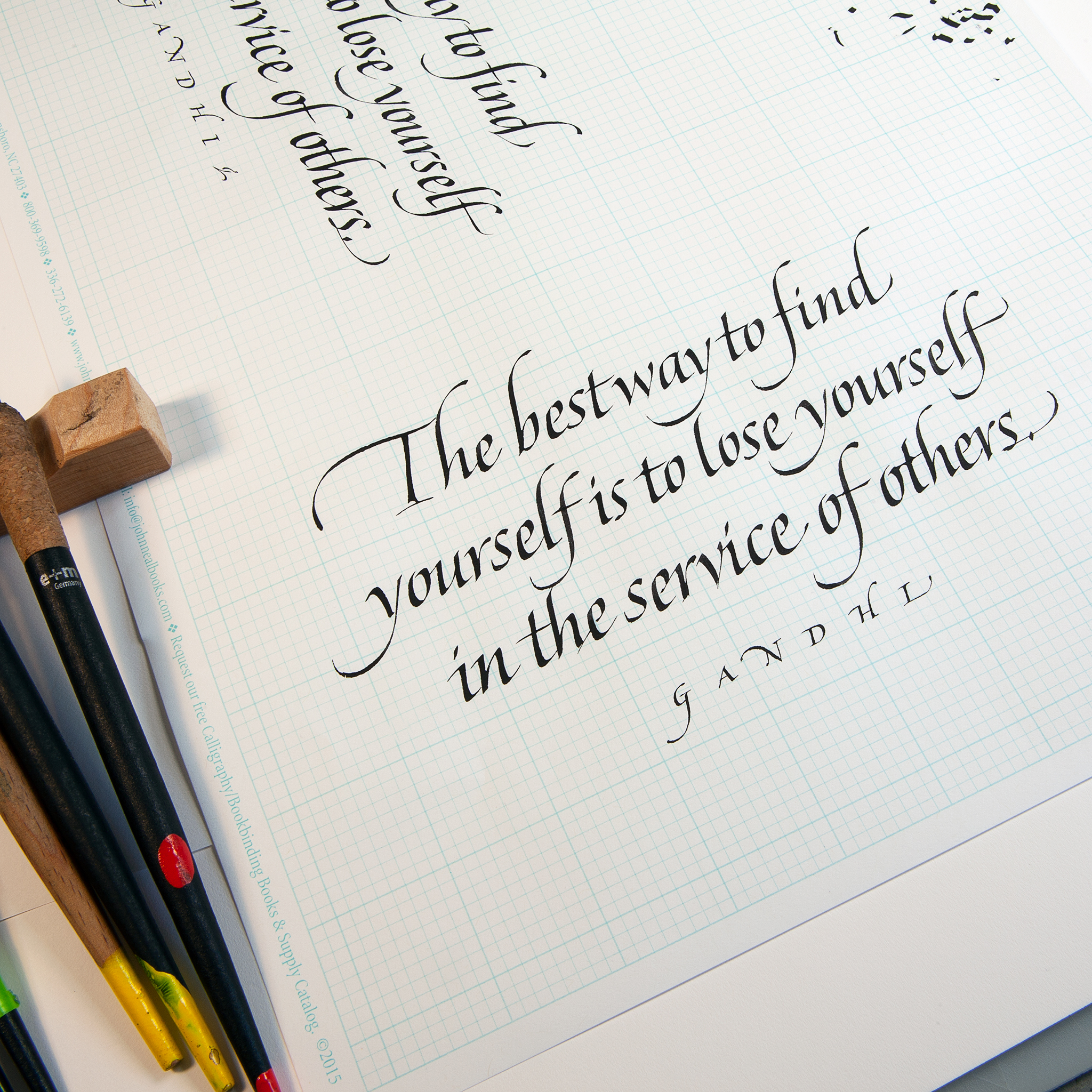
However to gain the most control and understanding of writing with a broad edged pen, one needs to learn to handle a dip pen*. Metal nibs by Mitchell or Brause are the most commonly used. Others include: Speedball, Automatic, Coit. Of course we need to mention the reed and quill. Quills are cut from feathers, and reed or bamboo pens are cut from these 2 materials. Info on reeds and quills will be featured in another article.
One can fill the dip pen by actually dipping or feeding the reservoir with a brush.
Inks / Pigments
Higgens Eternal, Pelikan 4001, are good bets for beginners.
Paper
Bond paper that is fairly smooth and doesn’t bleed are good for practice. Nekoosa Bond, Mohawk superfine can be gotten from printers and/ or their paper suppliers.
Higher quality ( and more expensive) papers are used for finished work. There is a vast array of writing surfaces including handmade paper and vellum (skin). New York Central is a great source as is John Neal. Twinrocker is a hand made paper mill and can be reached from our links page.
All of these materials can be ordered from John Neal Books & Paper & Ink Books
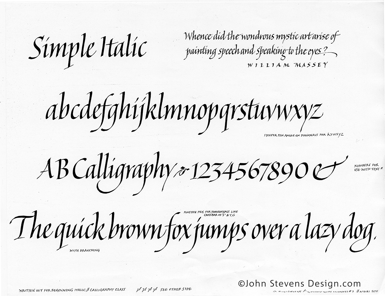
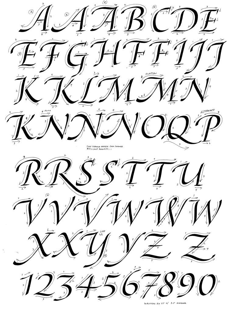
Here are 2 free calligraphy exemplars:
Italic lowercase (minuscules)
Italic Capitals
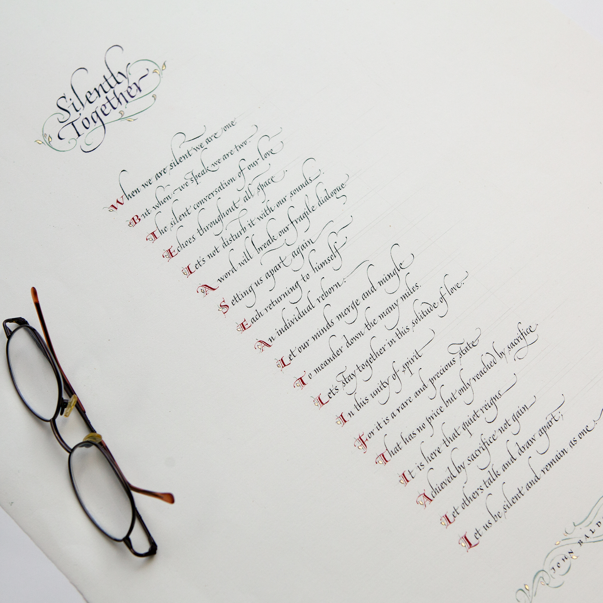
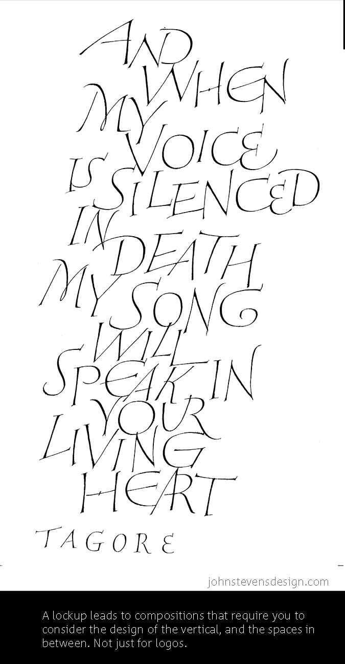
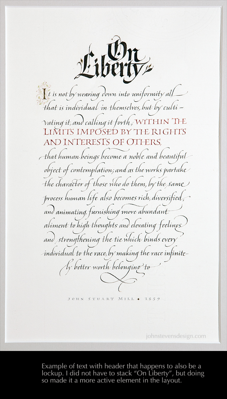
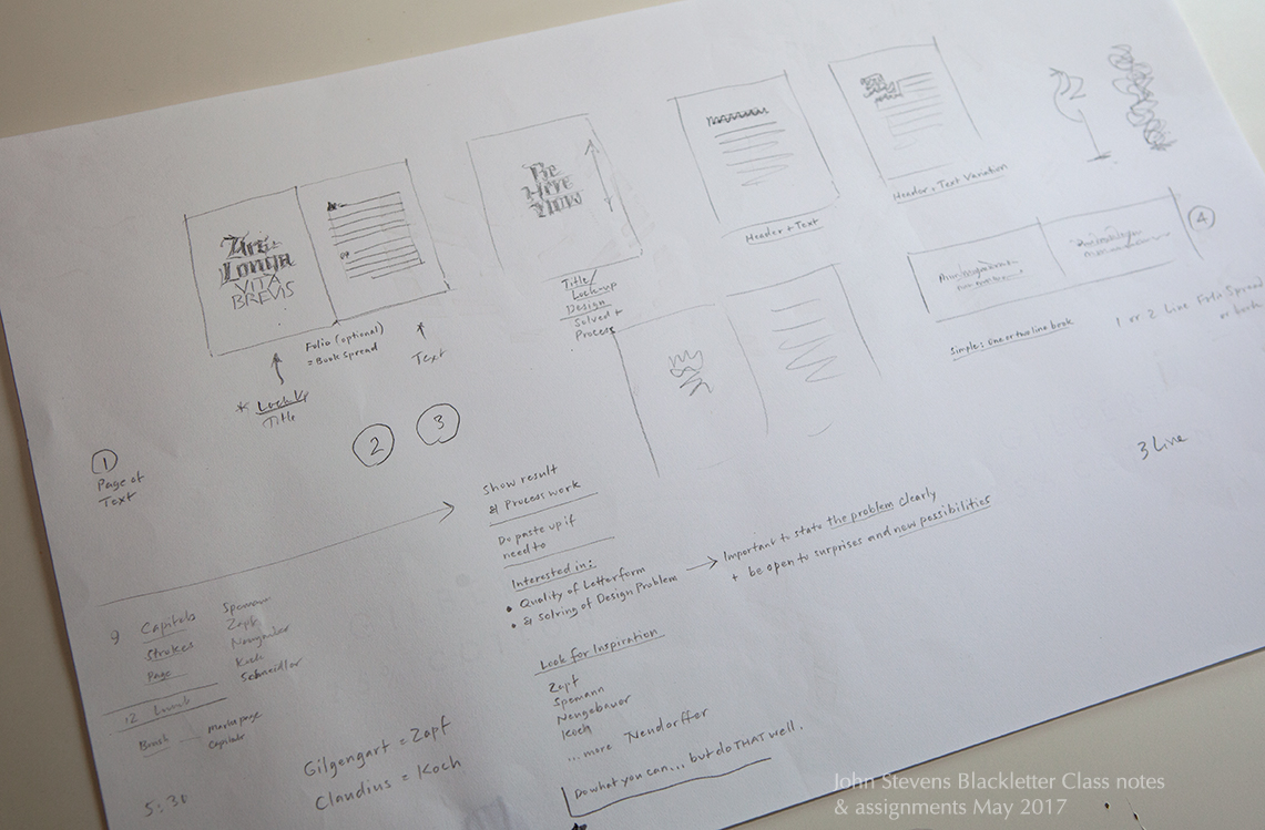
2. A Lockup (a title of at least 2 lines or 3 lines): I know some of you were unfamiliar with that term. It simply means that you are really considering the flow of the overall image, including the interactions and the white (negative space). Basically, design principles applied: solving the problem, which in this case brings up 2 skills: your letterforming and your problem solving. It is a bit of a puzzle. It is important because it makes you more visually aware (because you are more responsible for the image you are making). It also makes practice meaningful. Btw, even working out one word is useful. The idea is to work in a non-habitual way, and develop “seeing” more. Remember the Visual Language topic?
Additionally
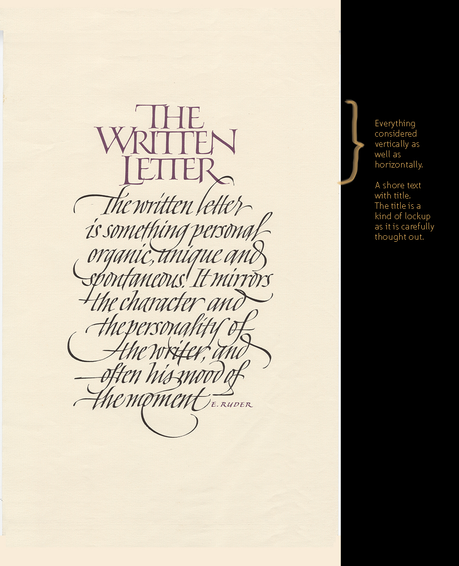
The other assignments were recommended, yet optional: A Folio (spread with text and title considered as a whole), Drawing the letters, which helps us see and appreciate the finer nuances and get out of “ductus thinking.” Gathering examples that you think are great,
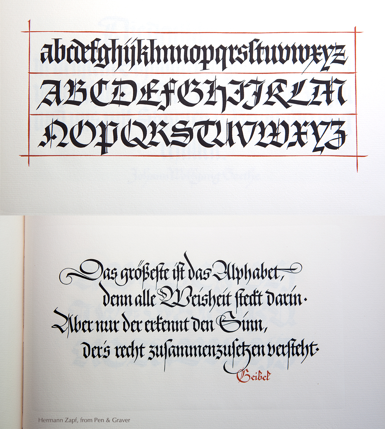
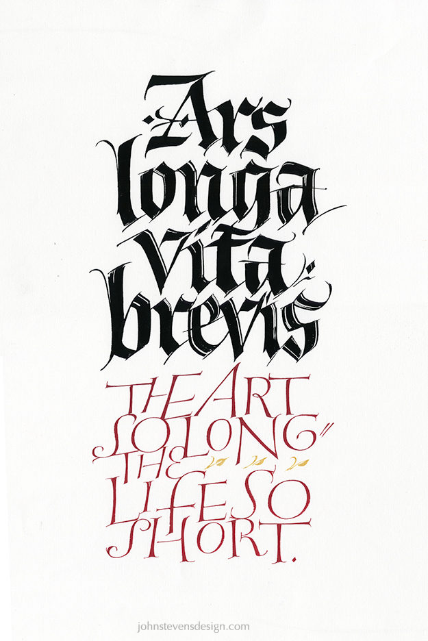
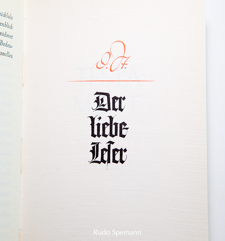
A two to four line quote on a page. The Geibel quote below by Zapf is a great example. In fact, it is a valuable lesson to copy the Zapf quote exactly, which will also tune you into the nuances he has included in this work.(but also design your own)
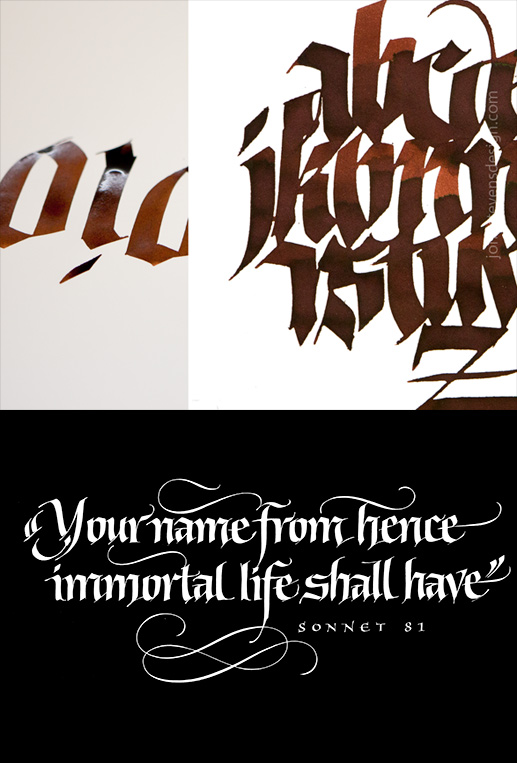
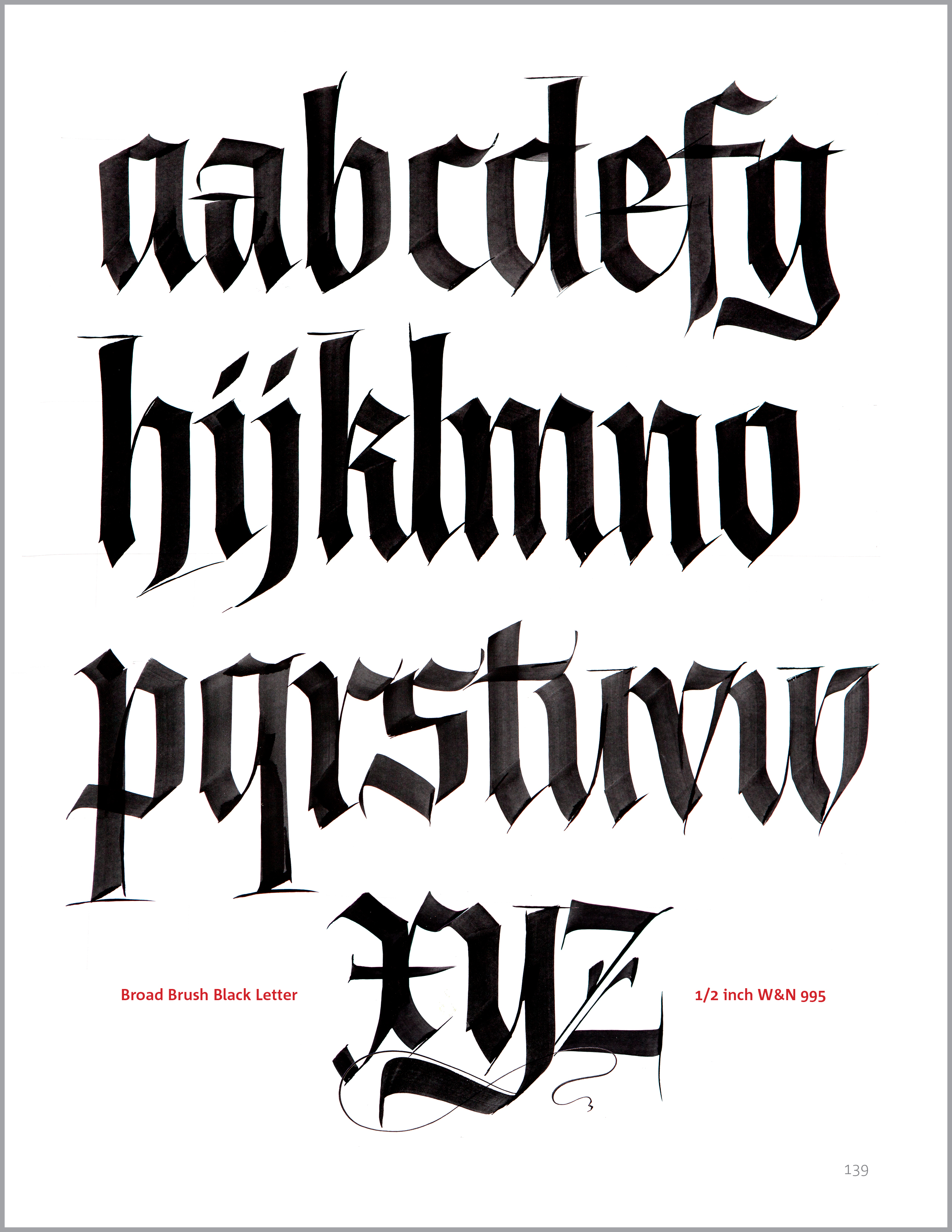
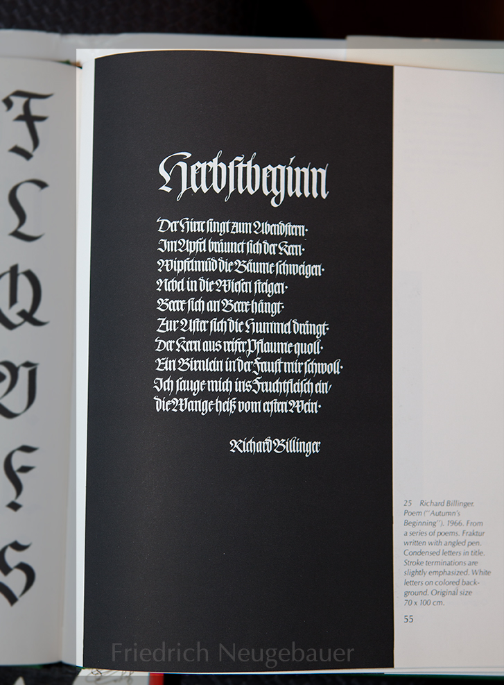
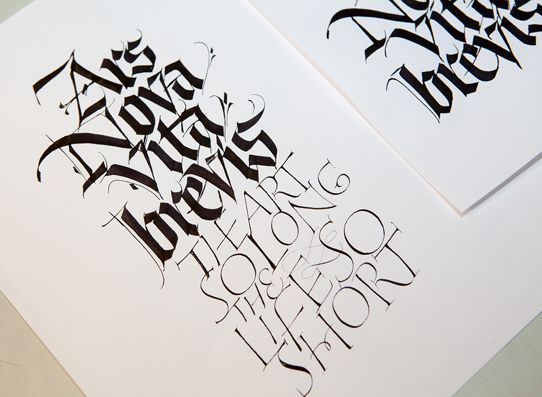
There was also a brush assignment: the page of strokes that were abstract yet related to Gothic. This is a training exercise to begin to show how to break free from an exemplar. Do what you can, BUT do THAT well.
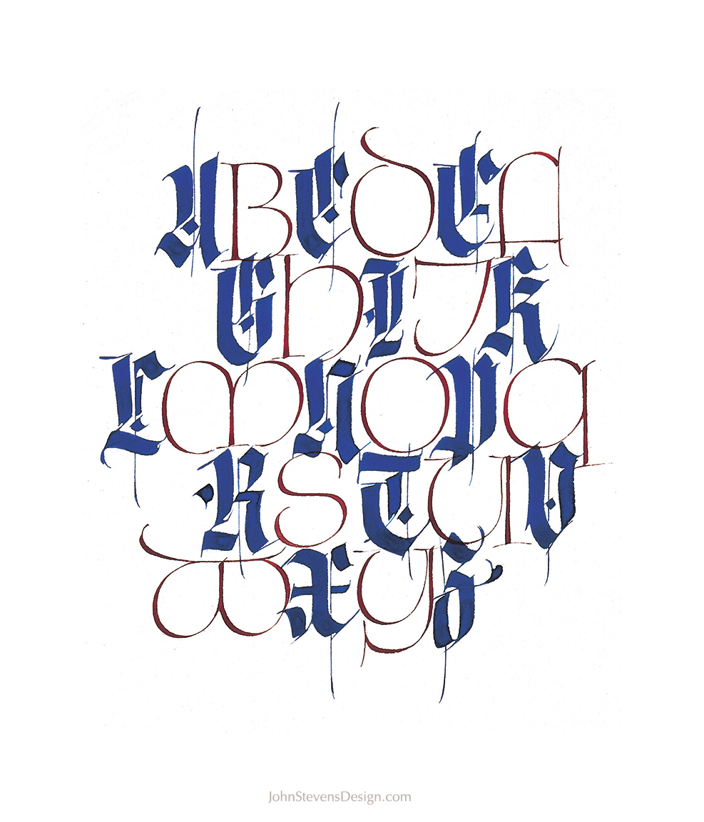
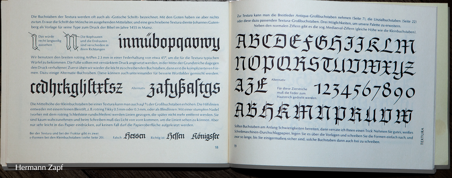
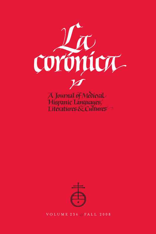
Images for Inspiration
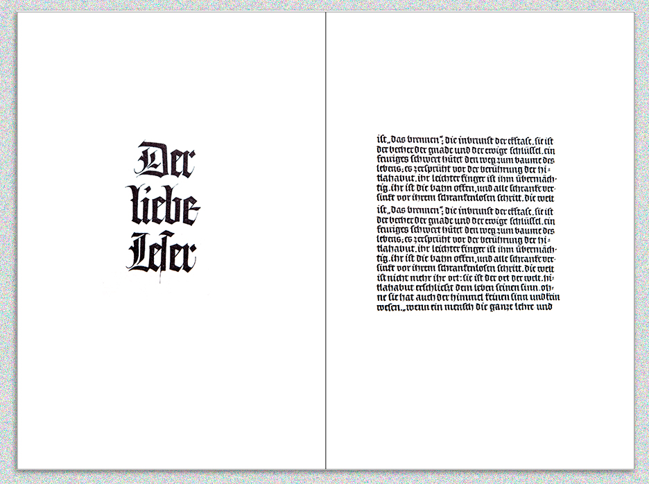
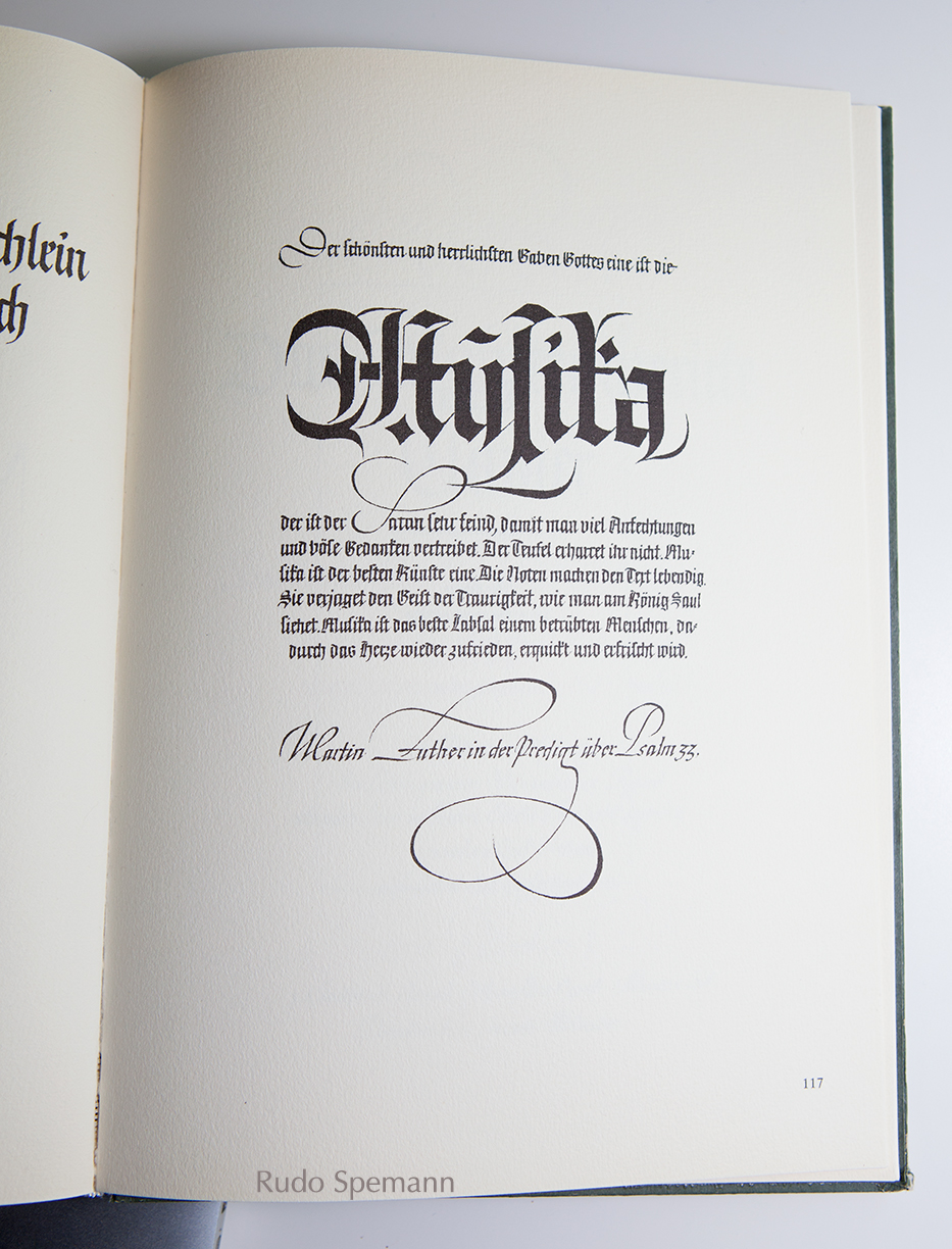
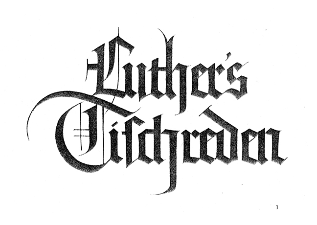
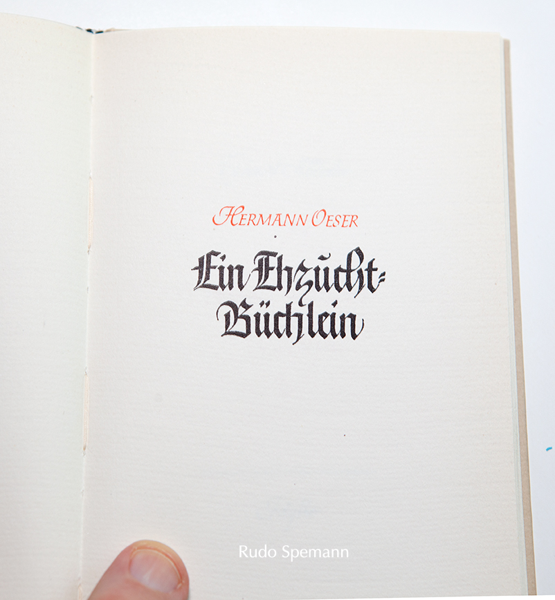
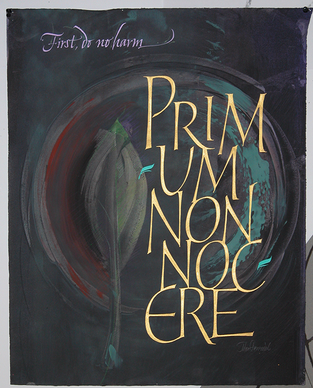
What can be done as image when the letterforms are high quality. Many calligraphers make the mistake of thinking a tricky layout will make a piece work, when in fact, quality letterforms and a well organized design will take you much further. The 2nd slide features 2 pages from Hermann Zapf’s Pen & Graver (which I spoke about). This is some of the finest Blackletter you are ever likely to see and is what turned me on to what Gothic can be. Lastly, I may add to this page, so bookmark and check back.